
TL;DR

Get kitchen gear delivered free with Prime
- Fast, free delivery on millions of items
- Prime Video, Amazon Music and more included
- Member-only deals all year
A House Beautiful report describes designers using red—from burgundy to earthy, brighter tones—in kitchens as an alternative to familiar white and cream palettes. The report presents this as a design trend, not a measured industry shift, and designers advise balancing red with neutral colors and varied materials.
Interior designers featured by House Beautiful are using red in kitchen projects as an alternative to familiar white, cream and ivory schemes, choosing shades that range from deep burgundy to earthy and brighter reds. The report frames the color as a way to give kitchens more personality, while the designers stress that proportion, complementary materials and the particular shade determine whether the result feels balanced.
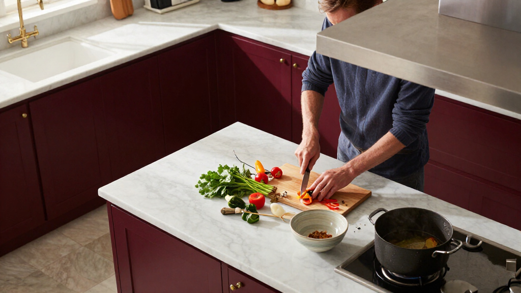
The examples in the report show red used in different ways rather than as a single prescribed look. A city apartment designed by Opa Architecture features Benjamin Moore’s Classic Burgundy on a peninsula. In another project, architect Kevin Lichten used red on lower cabinets and paired them with gray upper cabinets, which he said helped calm the overall palette. British designer Uns Hobbs used deVOL’s Refectory Red in her own kitchen, describing the result as both bold and timeless.
The designers recommend choosing a red that suits the room and the homeowner’s taste. Hobbs says she prefers deeper reds to brighter tomato shades for a traditional effect. Lichten says brighter colors can work, but cautions against tones that look “too chemical or artificial”; he cited Benjamin Moore’s Red Parrot as a more earthy option in a project. These are designers’ judgments, not independently tested guidance or evidence that one shade performs better than another.
The report also emphasizes restraint and supporting finishes. Lichten says proportion matters and recommends balancing red with other colors. Hobbs suggests warm neutrals, stone, brass, marble, wood floors, vintage art and ceramics; architect Aria Jahanshahi argues that texture and surrounding materials can soften the dominant color. The examples range from a red peninsula or lower cabinets to more expansive use, but the article does not quantify how common these designs are.
Red Gives Kitchens a Bolder Role
The shift described in the report reflects a design choice with practical consequences: kitchen color can shape how a room connects to the rest of the home. Jahanshahi says kitchens increasingly serve as places where families gather, talk and spend time beyond cooking. In that view, a more vivid palette is intended to make the room feel welcoming and distinctive, not simply functional.
For homeowners, the examples offer a middle ground between keeping a neutral kitchen and committing every surface to a strong color. A peninsula, cabinet fronts or accents can introduce red without making the entire room red. Pairing it with wood, stone or warm neutrals can also add contrast and texture, though the article does not provide cost, maintenance or resale data. The design claims should be understood as professional opinions rather than proof of a broad market change.
As an affiliate, we earn on qualifying purchases.
From Neutral Palettes to Red Accents
White, cream and ivory have long been common kitchen choices, according to the House Beautiful report. The designers interviewed say some clients and homeowners now want more personality than a restrained palette provides. The report does not establish when this interest began or whether it represents a change across the wider home-design industry.
Red has associations that can make it feel like a riskier choice for a room used every day. Lichten describes it as visually assertive, while Hobbs points to its warmth and traditional character. The article also notes the familiar association between red and appetite, including the use of red in fast-food branding, but does not offer evidence linking that association to people’s choices of kitchen color. Its central focus is on residential design and the ways designers temper the color through placement and materials.
“People have become a little bored with playing it safe and want more personality in their homes.”
— Uns Hobbs, British interior designer
How Widespread Is the Red Trend?
The report presents examples and opinions from three designers, but gives no survey, sales figures or market data to show how many homeowners are choosing red or how quickly interest is changing. It is not clear whether red kitchens are becoming common across the industry or remain a choice among particular designers and clients. The material also does not compare the cost, upkeep, resale effect or long-term satisfaction of red kitchens with neutral ones. Claims about red’s effects on appetite are mentioned as context, but no evidence is supplied that they explain this design interest.
Homeowners Weigh Shade and Scale
The report identifies no upcoming industry milestone or follow-up data. For homeowners considering the look, the designers’ suggestions are to decide how much red the room can carry, select a shade that fits the intended style, and test it alongside existing finishes. Starting with a peninsula, lower cabinets or accents offers a less extensive commitment than applying the color throughout the kitchen.
Whether the trend spreads beyond the featured projects remains to be seen. More reliable evidence of a wider shift would require later reporting with broader designer, renovation or product-sales data. For now, the confirmed development is that the designers interviewed are using red in specific kitchens and recommending ways to balance it—not that neutral kitchens have broadly fallen out of favor.
Key Questions
What red shades are designers using in kitchens?
The report describes deep burgundy, earthy red and brighter shades. Examples include Benjamin Moore’s Classic Burgundy and Red Parrot, as well as deVOL’s Refectory Red.
How can red be used without covering the whole kitchen?
The featured projects use red on a peninsula or lower cabinets. Designers also suggest red accents, paired with calmer colors and materials such as wood, stone or warm neutrals.
What colors and materials do designers pair with red?
Suggestions in the report include gray or warm neutral cabinets, granite, brass, marble, wooden floors, vintage art and ceramics. The designers say these elements can add contrast and texture.
Does the report show that red kitchens are now common?
No. It describes selected projects and designer opinions but provides no market data or survey establishing how widespread the choice is.
Source: rss
Halloween Picks
halloween
As an affiliate, we earn on qualifying purchases.